MARYAM ALMALKI: Voice Architecture & Verbal IdentityProject
Maryam Almalki is a Qatar-based luxury footwear label producing sculptural, minimalist heels. Designs are conceived in Doha, handcrafted in Italy, and created for a clientele fluent in quiet luxury. The brand references The Row, Khaite, and early Phoebe Philo-era Céline.
Before the project, the verbal identity was fragmented and tonally out of step with the aesthetic. My role was to define the complete tone system, interview the founder, and build the brand's language into a structure that could be used and extended without me. Midway through the project, the brand announced expansion beyond footwear into additional product lines. I updated the homepage copy in a single pass. The system required no revision.
Scope
1 | Tone system: three pillars with application notes and do/don't guidance
2 | Website copy: homepage, about, contact, order policy
3 | Editorial samples: product descriptions, Instagram captions, newsletter subject lines
4 | Format-specific implementation guidance for future consistency
Process
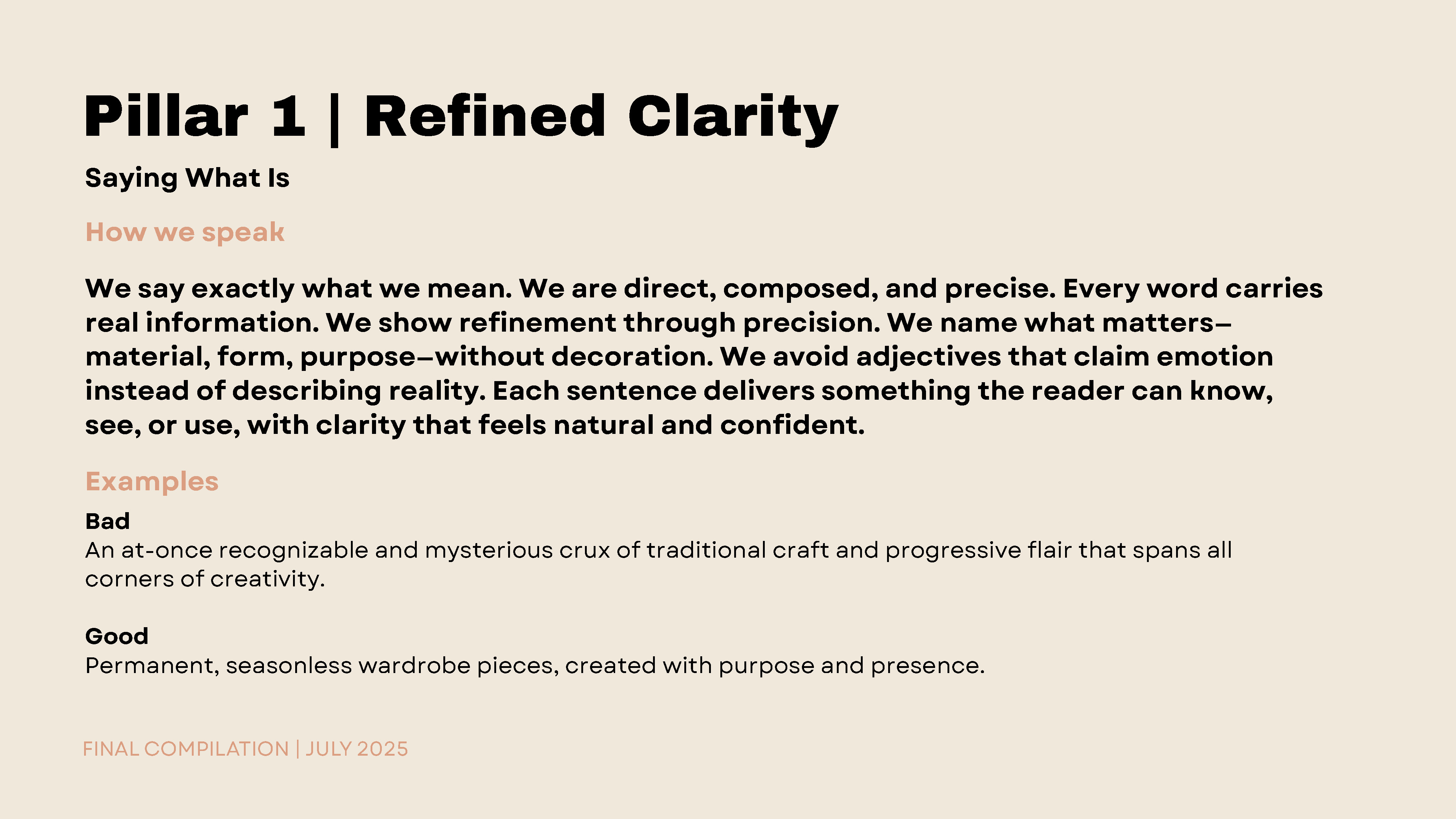
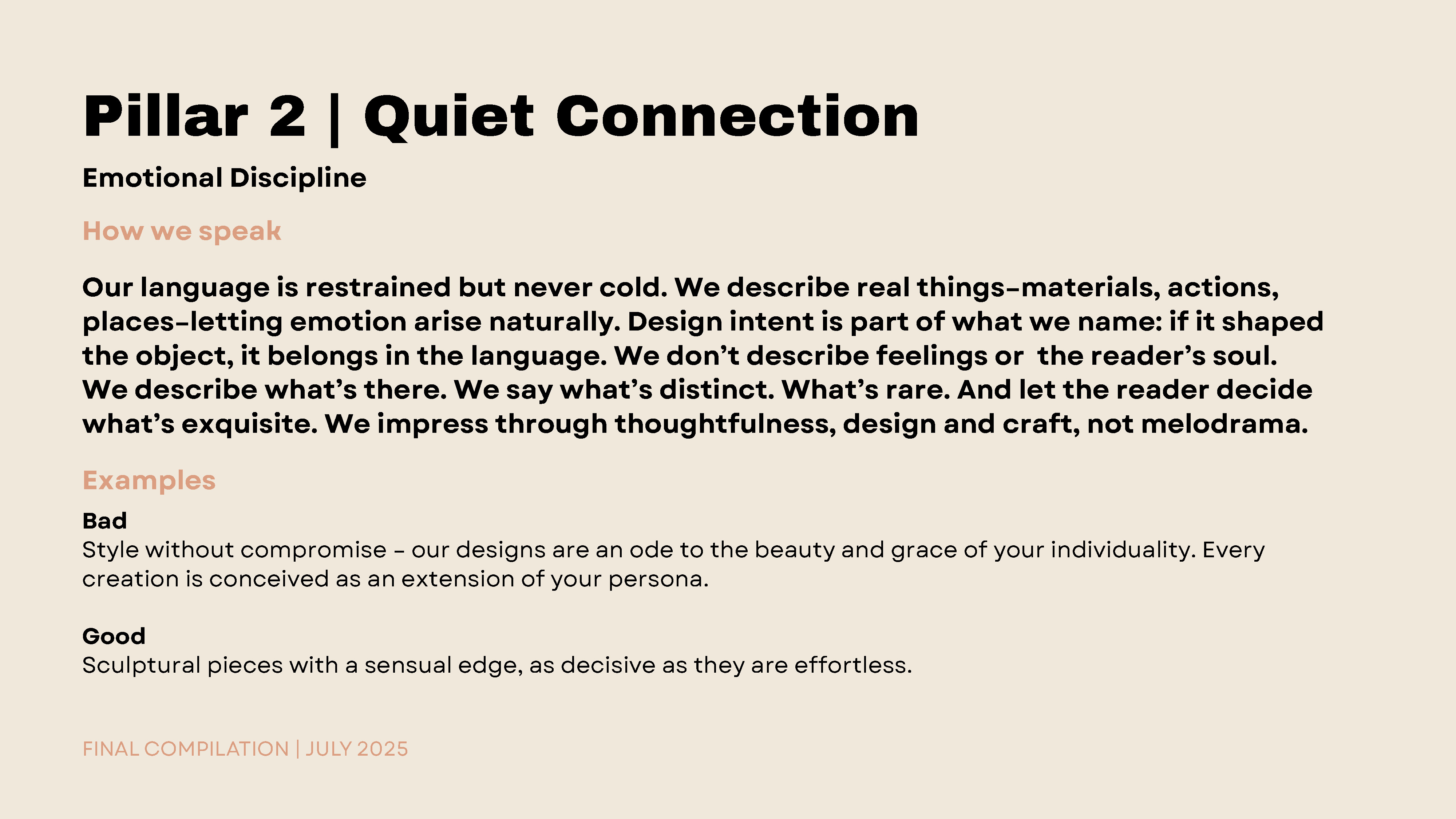
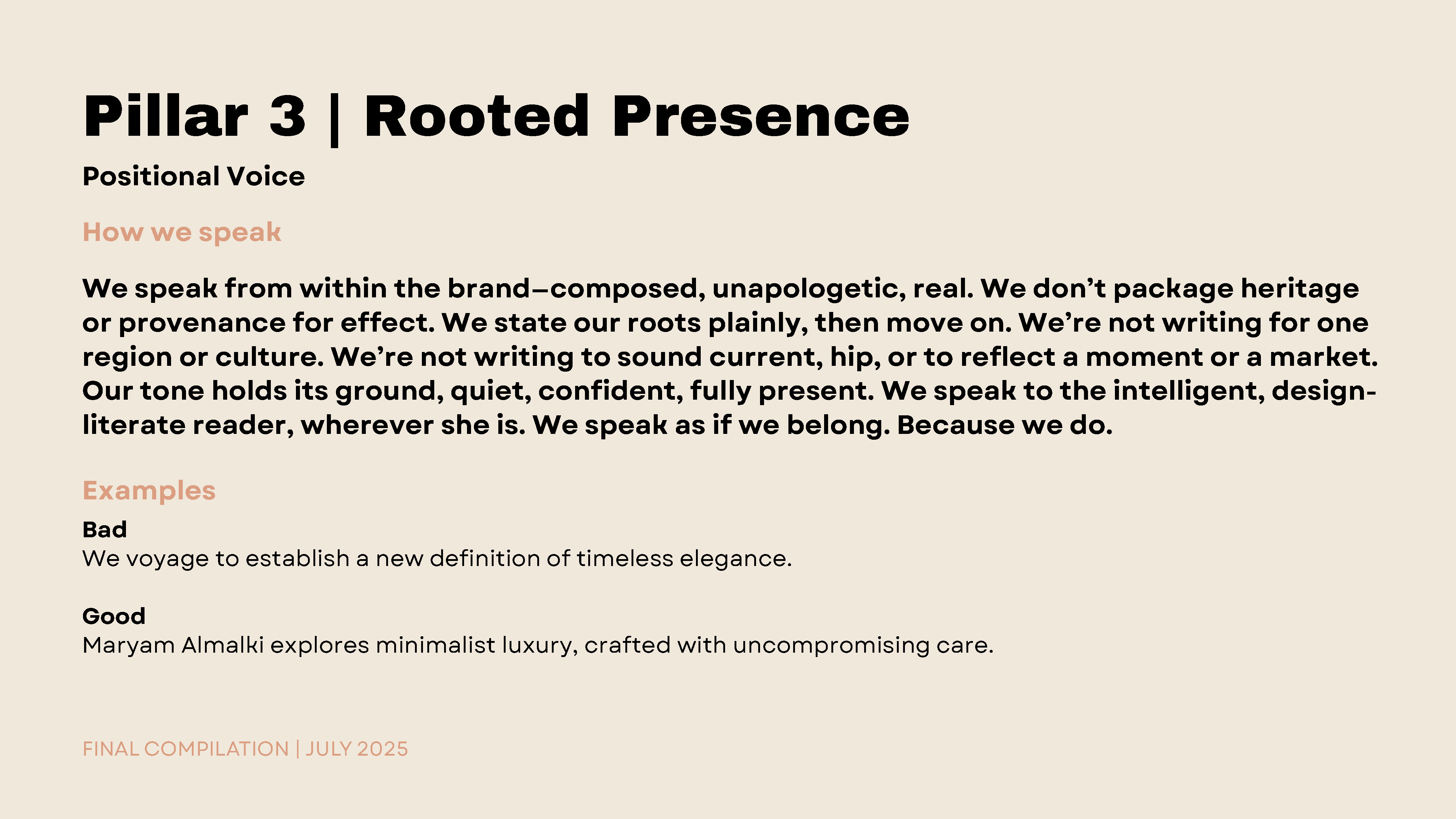
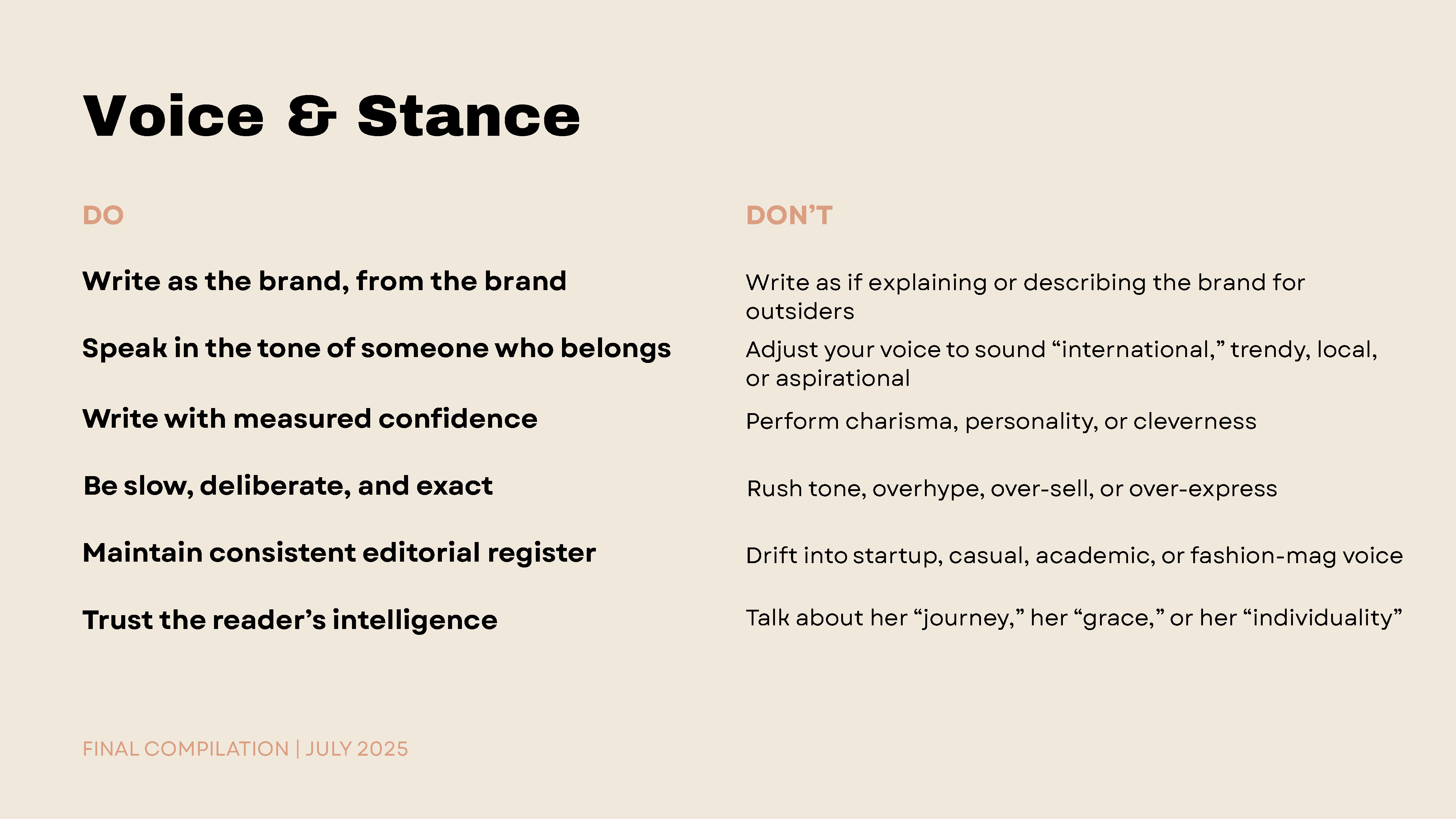
Conversations with the founder and a close study of the visual direction formed the basis of the verbal identity: a system grounded in clarity, proportion, and integrity of form. The earlier copy leaned mass-market; the new language aligns with the brand’s architecture: composed, intentional, and minimal.